Solution
A strategic design project connected Jan De Nul Group's designers and Dropsolid.
The Drupal website allows the marketing team to set up their own beautiful landing pages with a number of custom components.
Rebranding with 2 key objectives
The company’s previous corporate website had long reached the end of its life cycle. The site was not responsive and completed projects and cases were not sufficiently highlighted. In addition, site visitors struggled to navigate the website in an intuitive way.
A recent company-wide rebranding exercise had provided the online team with an excellent chance to tackle the digital side of the business. The new website would have to be fully in line with the group’s newly created corporate identity and at the same time be tailored to the different target audiences. This resulted in two key objectives:
- Communicating the group’s corporate identity and completed projects to investors, partners and potential employees using an experience-orientated approach.
- Serving the wide range of target audiences - including customers, press and NGOs - as efficiently and clearly as possible.
Balance between design and UX
We set to work with a strategy and design track that relied on close collaboration between the Jan De Nul Group designers and the Dropsolid design team. During a series of initial joint workshops, we mapped the existing website and analyzed the needs in terms of design, user journeys, information architecture and functionality. More practical items were also discussed. Extensibility and maintenance were two key requirements for ROI and long-term success. Subsequently, we added the various requirements to the wireframes and the finished design, respectively.
Wireframes and the resulting design are always built on a combination of aesthetic considerations and practical user-friendliness. Two concrete examples of this important search for balance:
Use of animations on the site
While animations add a certain visual appeal to a digital experience, statistics show that they do not always convert as hoped. An abundance of animated graphical elements distracts attention from the content. In addition, animations have a negative effect on website accessibility. We decided to take on these concerns by using smart animations. Certain visual animations only start when visitors hover their mouse over a certain item. This subtle equilibrium allowed for a highly efficient combination of style and efficiency.
Interactive map and flexible display options
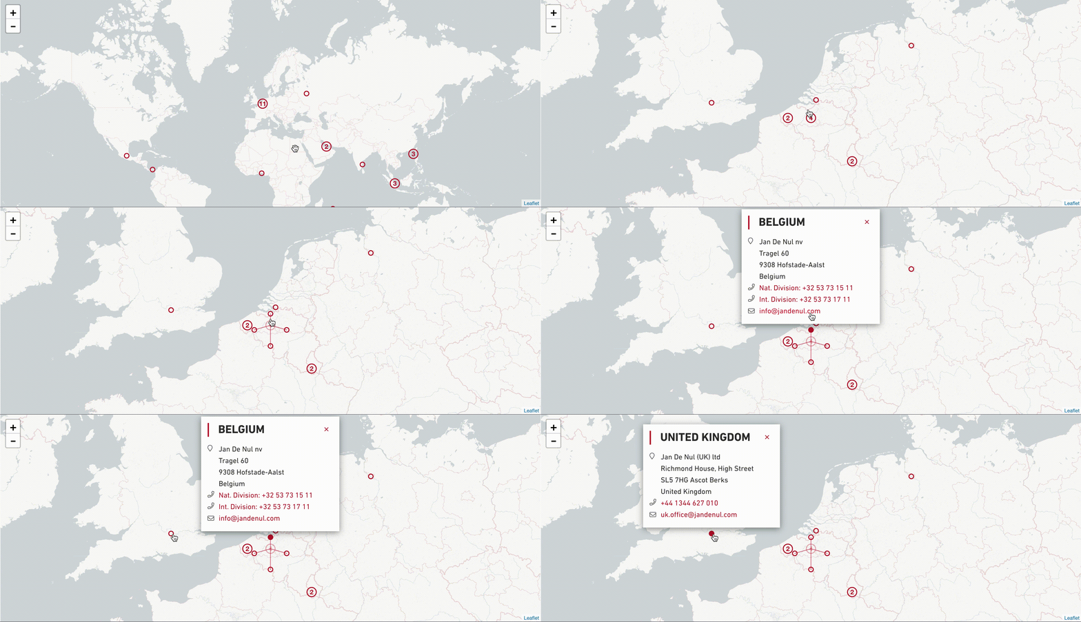
An interactive map that provides an overview of all finished projects. It was designed with easy embedding in mind, allowing the map to be displayed in other places on the website; for example, on another page. The map view is also scalable for easy browsing across devices with different screen sizes.
Flexible display options for case pages. The content team can easily add new projects or case studies and include quotes, images or rich media, without help from the IT team.

Drupal website with flexible content blocks
As a next step, Dropsolid’s development team started building Jan De Nul Group’s online experience through Rocketship, Dropsolid’s Drupal-based platform for digital experiences. We developed a selection of custom Paragraphs. Paragraphs are flexible content blocks that webmasters and content editors can use to easily create and shape the structure of a web page, in full compliance with the corporate identity and technical requirements of their digital environment. Using Paragraphs, we created a number of features that allow the internal content team to make changes. A few examples include:
Flexible display capabilities
A visual timeline that includes a comprehensive overview of the company history. Items can be easily adjusted by content editors on the marketing team.
Animated overview of highlighted company figures.
File upload function for press releases. When communicating under time pressure, every minute counts. Members of the communications team can easily add external pdf files or images to their news items. Behind the scenes, the download link and other technical information are automatically updated for each upload. See the bottom of this financial report for an example.
The paragraphs were developed in a number of different styles, in line with Jan De Nul Group’s existing corporate identity. This gave content editors the freedom to choose their layout of choice while ensuring scalability and responsiveness across different screen sizes.
The result?
The group’s new corporate website reinforces its new branding and is fully in line with the values the company wants to express. The innovative design goes hand in hand with user-friendliness and accessibility - on any device.
Jan De Nul Group’s online team is in full control of its website. Team members can add pages and content blocks, which are guaranteed to be fully responsive and visually attractive. This allows the organization to focus on further expanding the website, without any technical difficulties.
Finally, the Dropsolid design team also drew up a digital brand style guide, which provides direction for all development work. This way, Jan De Nul Group is fully prepared for its online future.
About Jan De Nul
Jan De Nul Group is one of the leading dredging companies worldwide. As a family-owned multinational business, the organization has expanded its focus over the years to an impressive array of maritime-related engineering work, such as the building of offshore wind farms. Social impact and sustainable development are always at the heart of these endeavors. This robust long-term vision called for an equally strong digital presence to back it up.